Archive for April, 2010

Beach (or something like it) Brilliance

April 21, 2010

Corona is so confident with its beers association with the beach that it can have a label-less bottle in its commercial and still be effective.

There is something inherently right about a Corona on a sunny day at the beach. Why is this? Well, it’s really quite simple. Corona has focused solely on associating their beer with the beach. Seems…too simple. Does peripheral route processing ring a bell? For most of us, probably not. Peripheral route processing is a term used in psychology when talking about persuasion. Peripheral route processing uses cues–good-looking women, pro athletes, surreal environments–that trigger acceptance without much thinking. For Corona, the cue is the beach and the vast amount of things that relate to it. The beach isn’t just any beach, its paradise. The commercials also have no spoken words, just a bottle of Corona and a pleasant setting. A reoccurring theme in Corona commercials is the surreal, relaxed, paradise-like beach, attractive woman in a bikini and of course, the Corona.

There are a lot of important components other than the sight of a beach that compels buyers to consider purchasing Corona. Putting an audience into is good mood is key when using peripheral cues to trigger persuasion. What better way to fast track the audience into a pleasant mood than by playing sleep machine music as the audio for the commercial? The only sounds in the commercial are the soft sound of waves washing up onto a beach, a slight breeze, and seagulls. It is all about feelings. Generally, the beach has pretty good feelings associated with it because of warm weather, sunshine, water, fun, and relaxation. Corona emphasizes this in its commercials to play on the psyche of potential customers. Even though people might not see a Corona commercial and immediately want to go to the beach, it doesn’t mean that next time they do go to the beach, or someplace like it, that they wont grab a six-pack. Corona really plays on the situation that the consumer is or should be in while drinking a Corona.

The beach or something like it… What else is in these commercials that program us to associate Corona with the beach (or something like it)? The beach can represent many things that a potential buyer could associate his/her Corona purchase with. Going to the pool is kind of like…going to the beach. Lying out in the sun is kind of like…going to the beach. Relaxing on a warm day is kind of like…going to the beach. Are we seeing a trend here? This is exactly the trend that Corona wants its potential customers to see. If all these things can are kind of like going to the beach then people may be compelled by Corona’s commercials to purchase Corona when doing these things. The association of positive things is the key factor (because we know its not the taste) to Corona’s success.

The Axe Effect

April 21, 2010
A more appropriate slogan for Axe body spray would be ‘the sex effect’, but then again, they do have their commercials to give viewers the sex effect. Axe commercials don’t really beat around the bush at all when it comes to sex. The sexual innuendos depicted in Axe commercials are impossible to miss (obviously this is done intentionally). We’re all familiar with the phrase ‘sex sells’ but axe seems like they are selling sex, or at least selling the product that guarantees some action. Axe just doesn’t throw the pretty girl out on the television screen to promote its product, they throw the pretty girl out onto the screen to show the audience what girls like her will want to do to guys who wear Axe.
It is blatantly obvious that Axe commercials target males. Males tend to be susceptible to persuasion by scantily clad women and stereotypical fantasy-type situations. Axe commercials often play on the fantasy situation ranging from improbable ways to get a woman’s phone number to having sex with a random woman in an elevator. The depiction of such situations tells men that these things happen if one is to purchase Axe and use it. In the Axe elevator commercial, a guy who looks like a male model sprays Axe on himself then gets off the elevator while another average joe gets on and is accompanied by a beautiful woman who gives off the sexy secretary vibe. True to Axe commercial fashion, it is implied that the average joe gets a quicky in during the elevator ride. So, Axe makes up for sub-supermodel looks? Yes.
By using catchy sexual commercials, Axe markets its products to many different types of men.
Man A, will try anything to get girls, thus the sexual content in the Axe commercial drives him to try Axe. Even if Axe does not get him a girl, there is a good probability that he will continue to use Axe in hopes that one day, the situations depicted in Axe commercials will come true.
Man B, already gets girls and attributes some of this ability to his use of Axe. In this case, the sexual events depicted in the commercials reinforce the reason to purchase Axe.
Man C, gets a confidence boost by using a product that he thinks attracts women because of what he sees in Axe commercials.
The sensationalized situations that Axe bases its commercials off of don’t even have to be taken seriously for the marketing strategy to work. Do men really hit the deodorant isle and consider which fragrance is going to get them the most sex? Maybe, but probably not. More realistically, a guy would stand around in the isle for a minute or two starring aimlessly at the hundreds or cans of body spray and possibly grab the Axe. Why? Because of the cool “man” commercial he had seen a few days earlier showing a guy hooking up with hot random girls due to the irresistible axe fragrance radiating from his body.
Regardless of whether buyers of Axe bought it because they thought it was going to get them some ass or just because the commercials are provocative and entertaining, the rhetorical strategy used for sale of Axe products is sex, plain and simple.

GENERATION Y

April 21, 2010

This is the cover for the DVD and movie posters for the film, The Hangover. I found this picture online, but also own the DVD. The image is advertising the film and certain events that happened throughout its duration. This particular image also advertises a special version of the DVD (Unrated and Special Edition.

The apparent rough situation at the bottom of the ad indicates action and unexpected activities to take place. In order of this advertisement to play off of the title of the film, it needs to be positioned in the consumer’s mind, as a crazy night out.

This ad is gendered against the American male, making them look like wild men that cannot comprehend how to party responsibly. Also, the random assortment of animals combined with the tattered and beaten down cast, makes this ad powerful. This ad really relies on the generation Y crowd to be interested in drinking, partying, and craziness. The beaten up car and “killer funny” text further attempt to persuade its target market to buy into this generation Y themed filmed.

If you’re wondering who generation Y is watch this…

The middle-right quadrant of the screen represents Vegas. Anyone who has been to Las Vegas or seen a movie with LasVegas has seen that sign. Vegas represent trouble when portrayed through three 25 to 30 year old men. Las Vegas is a stereotypical (for good reason) location that represents gambling, drinking, and sex. This image is defiantly trying to pitch the idea about how crazy and funny this movie is.

The title is written in old neon sign fashion. This technique represents Las Vegas, the city of lights. The Unrated text appeals to the high school and college demographic in that the typical, 15 to 25 age group would most definitely pick an unrated version. The overall image is a good portrayal of the film, and would definitely rekindle some of the highpoints for someone who has seen it.

The background is blue sky; this makes the rugged situation at the bottom of the image a lot more noticeable. The blue sky also helps the contrastingred colored title and text throughout the image to pop. This forces the viewer to scan the entire image. The spacing of the image and the text allows for a complete view of the image, not just a quick glance.

The overall clothing the men are wearing in the picture is very tattered and dirty which leads the viewer to believe it’s caused by beatings and exhausting circumstances.The gentleman pointingto his tooth and standing very staggered, leads people to believe something happened to him that he was unhappy about. The other 2 men in the image look as thought they have been beat up. Also, the overall image combined with the title of the film, leads viewers mind to immediately assume that the characters had a crazy evening.

VICTORY WITH SKYY

April 21, 2010

This advertisement is for SKYY vodka. It’s a photo I remember seeing several years ago in a Maxim Magazine. By using a provocative image of a woman, the purpose of this advertisement is to sell the company’s alcoholic beverage.

The foremost detail is of a gentleman holding martini glasses and a bottle of SKYY vodka. He is standing over a woman who is sunbathing in a sexy provocative bathing suit. He is a man that appears to be sophisticated and dressed in formal attire, thus giving the assumption that he is of high class. This provides an appeal to men because the ad is stating that the consumer, that they can be classy and sophisticated as well, if he drinks SKYY Vodka. The male in the photo isn’t given an identity causing the male consumer to imagine himself in the photo, making the desire that much more endearing.

The two are in a beautiful, almost surreal setting making the possible consumer wanting everything the two in the photo have. Since this was found in a Maxim magazine, men are more likely to believe that if they drink SKYY and dress high class, they’ll get the girl that is almost fake like. This ad demonstrates control over men and helps the consumer wasnt to feel this strength as well.

In several different places within the SKYY Ad are v’s. V for many means victory and by attaching victory to this ad, the consumer is able to relate this instance of victory with their personal future experience where they’ll experience victory themselves. Thanks to SKYY Vodka, the consumer will be victorious. Even Nike, a company that brands it’s self by a logo is presenting a new V for victory tactic. This helps to reassure the viewer that victory will be accomplished by drinking SKYY Vodka.

Visit NikeBlog-V for Victory to see additional victory photos.

Even though the ad wants men to think they hold the power however in this photo one might see that the woman doesn’t need to get up when a man is above her, making the woman have the power.

Now I pose the question for you… is this advertisement by SKYY Vodka Gendered?

Are cartoons made for children?

April 21, 2010

For many parents, cartoons have become a trusted television element for their children to enjoy without the concern attached to other television genres. Parents have entrusted Nickelodeon, Cartoon Network, and The Disney Channel with their children’s spare time, and many parents have turned these channels into the babysitter on many occasions. The cartoons displayed on these channels are considered children’s cartoons, but the emergence of a genre of adult cartoons has slowly infiltrated television and has captivated audiences. These cartoons are not meant for children, but their presence and popularity among television audiences has influenced the content of current children cartoons.

The cartoon “Family Guy”, which airs on TBS is one of the most popular adult cartoons currently out. Its content deals with subjects such as sex, drugs, and even violence, but while pushing the envelope it has still abided by the FCC guidelines. Following the road paved by cartoons such as “The Simpsons”, “Family Guy” has maintained a healthy audience of all audiences. The adult topic matter can be viewed in clips such as these.

The clip shows “Stewie”, the child of the family, beating “Brian”, the family dog, for owing him money. The scene slowly gets violent, and demonstrates the extreme violence used to induce laughter from an audience. This genre of adult cartoon is so popular that Cartoon Network has devoted an entire lineup of programming meant for adults. The channel, which is primarily viewed by a children audience, switches instantly to adult programming without much of a warning. The children being entertained previously while watching Cartoon Network could possibly be exposed to graphic and violent content the next, without the parents even noticing. Mature content is not only being seen in the genre of adult cartoons but also in children cartoons such as “Spongebob Square Pants”.

The show “Spongebob Square Pants” is made for a children’s audience, but has recently been used in other genres such as commercial advertisements for Burger King. During a promotional series for Burger King the cartoon character SpongeBob Square Pants is seen rapping to the song “Baby Got back” by Sir mix-a-lot. Though the words have been changed to the song, the song is popular enough for many audiences to make a connection between the content of the actual lyrics to the cartoon character. The actual lyrics are describing the female attributes of women who are well endowed in the area of the buttocks. Below is a video of the commercial.

The song describes Spongebob Square Pants as having a buttocks with phone book implants. This description leaves a child wondering, what are implants? A topic which may or may not be appropriate for a child depending on the age, but because Spongebob Square Pants is being used a hook to reel in both adult and children audiences, the child suffers as a result.  The video was removed shortly after it appeared on network television, but my question lies on why the creators of the video found it appropriate to link this cartoon character with such an adult song. The falsely assumed likeability of the commercial lie possibly with the rising increase of adult cartoons, and the inability to create a barrier between adult and children cartoons.

Necessary Violence

April 21, 2010

The media has a hold on the opinions and actions of society, but the society also plays a role in what media is broadcasted to the masses. Through the years, we have seen the media become open to more liberal forms of entertainment and increasingly relaxed when it comes to the broadcasting or exposing violence, sex, and foul language through images and video. Though there has been a noticeable change in the boundaries set by the FCC in terms of what is aired, many Americans would like to maintain conservative programming for the under 18 demographic. According to the American Academy of Child and Adolescent Psychiatry “Extensive viewing of television violence by children causes greater aggressiveness”, and this has been the common thought process when creating television geared towards our children and adolescents. But can violence be used in television to evoke not a negative reaction but positive actions from a group of adolescents? That is the question pushed into my head after viewing a Public Service Announcement geared toward adolescents airing in Europe.

The video is graphic, realistic, and extremely violent. The message behind the video, to stop texting while driving, is understandably needed considering the rise in car collisions in recent years as text messaging has become more accepted. Though the message needs to be brought to the attention of the masses, was this graphic and very mature video appropriately targeted towards adolescents with the content of the material. The video does not merely show a car crash, but it details the traumatic events breaking bones, losing friends and family, and immediate recovery. As an adult I was taken aback, shut my eyes on parts, and squirmed throughout the PSA. So I can only imagine the reaction of a person younger than me, but I also will not be texting and driving anymore. Other PSA’s about this topic have been used here in the States, for example

This video appeals to the masses by evoking sympathy, and the use of a child attracts more appeal also. The video is not overtly graphic, but does show images of a car crash. It also speaks about the trauma associated with a car accident as a result of texting and driving. Both of these videos have effectively illuminated a societal issue, but one is extremely more graphic and violent. Is one more effective than the other? I cannot make that decision, but as an individual I am moved to stop texting and driving after watching the first video. Maybe it is time to use violence as a tool for positive change in society.

The changing face of advertising?

April 21, 2010

Race and the evaluation of racism has been brought to a new forefront with the election of our first United States President of African American heritage. This discussion on race and racism within America has been chronicled on CNN’s Black in America series and Latino in America. The discussion on whether the treatment of races within the United States is fair and just in the distribution of resources and opportunities is not debatable because history supplies the evidence to evaluate this question. The new question for evaluation is whether as a nation we have overcome many of the racial stereotypes which have contributed to the oppression of various races within the United States. If this question is assessed through the examination of how advertisements have altered their characterization of race and ethnicities the answer would be no.

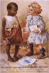
Race is a social construct created to justify the overtaking and oppression of various ethnicities throughout history, and as a country a climate of racism has plagued our generations due in part by the perpetuation of stereotypes through the media. Radio, Literature, and television can all be referenced as outlets to at one time confirm the not true stereotypes associated with different races. For example, the early stereotypes of African American dealt primarily with the notion of African Americans being savage people whom are not clean, smart, or trustworthy based solely on the color of their skin. This ad produced for Fairy Soap illustrates racism through advertisements. The caption at the bottom of the ad says “Why doesn’t your mamma wash you with Fairy Soap”. The African American child is dirty and poor through the depiction, and apparently if she uses Fair Soap like the White child she will no longer be of a lower social status. The picture also breaks down one of the oldest and most detrimental philosophies within America, that White is right.

Currently in the 21st century we have come very far as a nation to avoid racism such as this in advertisements. Unfortunately this statement is easily debated through the referencing just a few current advertisements for both Sony and Intel. Though many can conclude these ads are not meant to be racist but by accident can be misconstrued only allows me to make the claim that possibly, as a people, racism is innately programmed as to come to light even when it is not our intention. Looking at the Sony billboard we view a savagely depicted African American woman being chastised by a white woman.The caption reads, “White is coming”. Does this mean black will be taken over, oppressed, and pushed aside? Possibly. Though the race may not be “racist”, the ad is culturally insensitive to the history of our country. Very similar is this Intel advertisement.

We have a white man standing offer hunched down black men. The caption reads, “Multiply computing performance and maximize the power of your employees”. The word employee seems in this case to be comparable to the word slave, just a thought.

History has a way of creating a memory archive which subconsciously develops the way we think and perceive the world around us. Possibly the memory archive of members of oppressed races makes them ultra sensitive to current advertisement which is not actually racist in connotation, or maybe the ads are just racist.

OH TOM FORD

April 21, 2010

This fragrance advertisement by TOM FORD is part of the collection has sex written all over it. This is an ad I found while looking at things by TOM FORD. I am a big fan of his sunglasses, however this fragrance advertisement really caught my eye.

This Tom Ford advertisement for male fragrance has the bottle moved to a slightly less provocative position than the ad used in the smaller photo. A new feature is added in the larger photo that isn’t in the smaller ones and that is the mouth of the woman. This causes the imagination to run even wilder. This advertisement is obviously geared towards the male audience. The fragrance itself in the photo is supposed to representthe male’s genitalia.

The advertisement uses a female body that every woman who doesn’t have this body strives for. Even though this body is perfectly proportioned with an extremely large bust, no body in real life looks like that unless they are airbrushed. The collar-bones and thin neck are also to symbolize that the woman is skinny and in shape.

Watch: Beauty Evolution

The message this ad sends is that if you are male and wearing this cologne, this fragrance will bring you sexual, provocative instances, like the one in the photos.

The only thing other than the woman’s body and the text is the perfume. Since the placement of the bottle is between her breasts and the bottle is supposed to represent the male’s genital. This provides a representation that the male has a specific sexual power over the woman and by the look on her face she is either surprised or is in ecstasy.  Regardless of what the mouth may be communicating, the woman is obviously the object of the man with her mouth frozen in a most awkward position.

Since red is the color that is always linked to sin, anger and sex, the first thing to be noticed is the bright crimson color of the lips and nails. This bold color contrast from the rest of the ad draws the eyes toward the breasts and mouth, the most sensual parts of the woman in this photo. Also the lighting and/or oiling of the skin makes the body glisten and appear sweaty. It might almost make the viewer think of oil on the body, which could be linked back to sex.

Another thing to notice is the fact that the writing at the bottom blends with the highlighting and lighting of the image making this not as important as the image itself or the bottle. The shot is framed completely around the breasts and the mouth is purposefully shown. The face is of no importance to this sexual advertisement because the face shows emotion and a real person where as this advertisement is selling an object, in woman form. The position of the hands is also sexual.

“Stay at home mom’s” still considered target audience in cleaning product commercials.

April 21, 2010

While this video portrays both the husband and the wife, and as assumed the mother and father cleaning up dinner as most commercials do it is mostly the wife/mom  being the one in charge of most of the cleaning. In this video particular the boys state clearly that the mom “should have used glad force flex” which backs up the idea that the mom/wife is to be assumed that she is the stay at home mom who does all the cleaning.

This Glaad commercial was  made in the 2010 year, and while the years have changed in some sense as it is acceptable to have a women as the secretary of state, and speaker of the house it is still hard for commercials to change their focus on that idea of assuming the stay at home mom as the main audience member, while not even considering the possibility of having a different stay at home lifestyle.

This Reynolds wrap commercial was dated back to 1997 which is 13 years ago, and yet the same idea is being put across to the audience. The wife/women of the house do the cleaning as all of the “Oh-Oh” moments are clearly from other women. Yet again it seems as if having a man do the cleaning around the house seems as unheard of. This can be assumed, because not one man is shown in the commercial like the Glad commercial the women is assumed to do the cleaning, and there for the products are directed towards them in a way of them understanding it as being relatable to all of the “stay at home mom’s/wife’s”.

In this above febreeze commercial it is not clearly stated that the mom has been home all day as the other commercials leave out that part, but it can be as what is assumed. Even so this commercial not only shows that the man/boy is messy, and needs his mom or in other words a women to clean his mess up, and not only takes the credit for the aftermath, but completely ignores his mothers/moms help. This commercial was made yet again in this 2010 year, but seems to fit the stereotype that has not gone away apparently since the 90s in that the women is assumed to do the cleaning, and for that matter should not be credited for it.

In this 2009 “Wow” product commercial the women are the ones having trouble with the containers, and there is not one man shown until the 2:00 mark, and even with him in it he is not having trouble with the containers. I could assume they would stress the idea of women having the trouble with the containers, because they use the products more. Even when the husband/dad is shown he is not even at home. Which backs the idea up of the women being assumed as the stay at home mom, which like the Glad trash bags and the Febreeze spray consumers need to realize that times have changed, and while having these commercials relate to only women the times are different and with having for example a women speaker of the house and a women as the secretary of state the advertisers need to recognize this idea.

Infomercial seen as more of a joke then an actual product.

April 21, 2010

Earlier this year fans of Ellen DeGeneres, and just recently Saturday Night Live have seen the parody’s of the new Shake Weight  infomercial. As shown below,

(Ellen video parody)

(Snl video parody)

While the two videos are funny in the sense of this infomercial being seen as a  big joke it raises the question in why the beginning of the video states “specifically designed for women” as opposed to just being for everyone.

(the complete infomercial)

The shake weight  is also accessible for men, but that is not seen as their main audience being that on the website it only states on the bottom of the page “get shake weight for men” after the rest of the site is filled with the women’s shake weight commercial and pictures of women using the product.

[https://www.shakeweight.com/flare/next] (Shake weight website)

Not only does it stress that the product is “designed specifically for women” in the first few seconds of the video, but it also is stated yet again bold on the website.

The video then states that women will “go from giggly flabby and saggy to the firm, tight toned sexy arms you want”  this raises the question on how the people who created the infomercial know that every women wants to have sexy, toned arms. Instead of the infomercial stating that you could get sexy arms if you choose it is not allowing another option. I can assume this is meant for the group of women that are concerned about their upper arms being sexy and toned, but it could lose customers in the sense that they would rather not  have tone arms that in some sense could make them look more mainly.

I also would like to know what evidence there is that the product is “designed specifically for women” because I could easily make a product and state the same thing. Like other infomercials/commercials the shake weight should spend less time finding women to have in their infomercial and more time showing the facts of their accusation.

For example,

(Sham wow infomercial)

This video shows not only a before and after with using other products such as paper towels, but it also shows examples of how to use the product. In the shake weight commercial it gives no evidence that the women using the product have benefited from it, but rather shows them dancing at the end. It also does not set itself apart from any other products such as just a free weight in that it does not prove how it is any different.

As an audience member, and a women of this infomercial it is seen as more of a joke then an actual product in that I would prefer watch parodies on SNL, and other popular networks then buy a product that could with no evidence make my upper arms toned and sexy.